- 20 Jul, 2020
- read
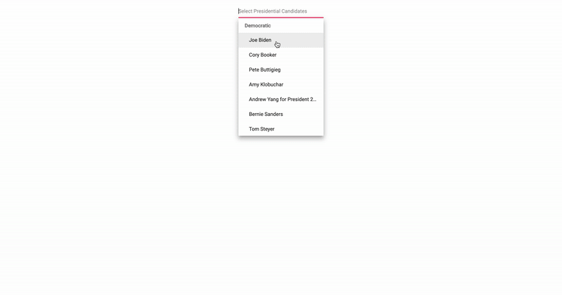
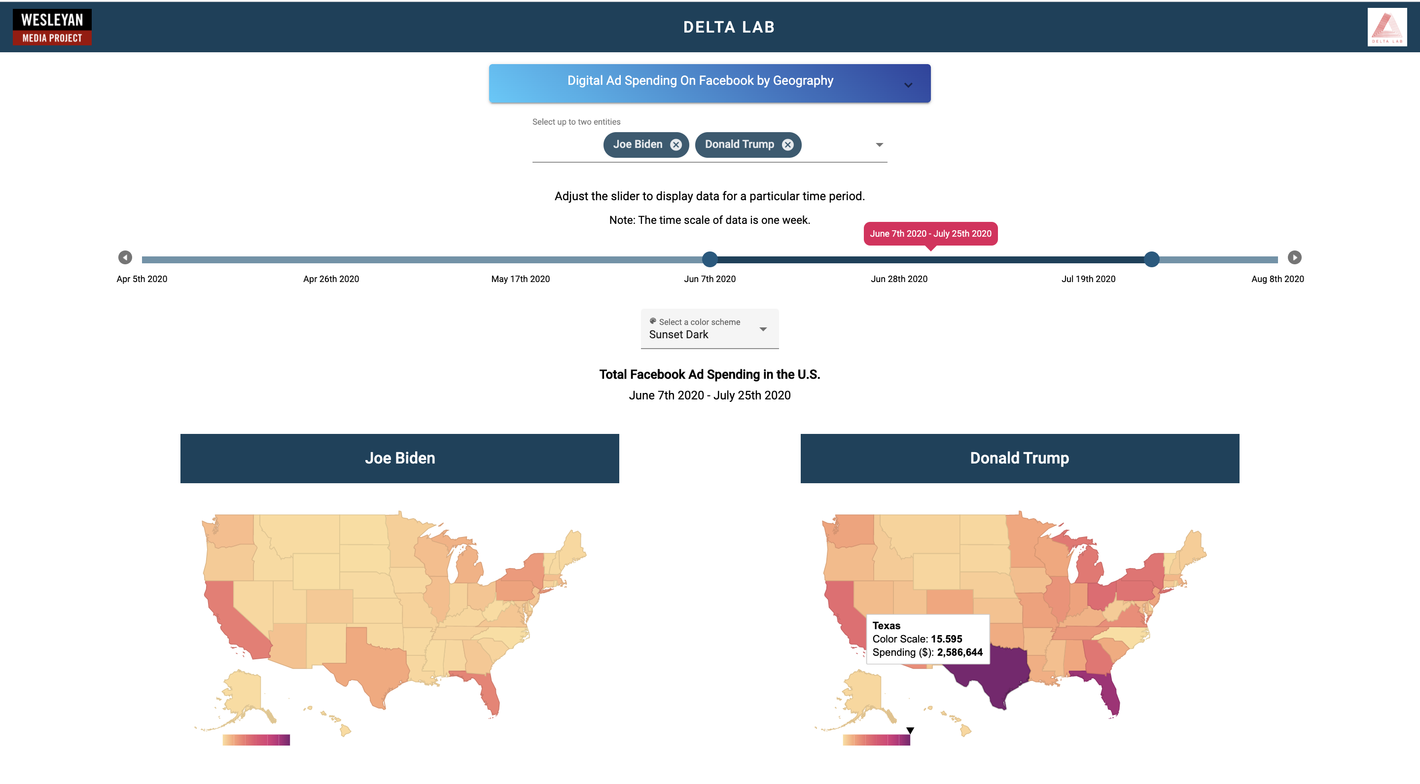
📊 Facebook Ad Spending Visualation
In its tracking of campaign spending on Facebook, Wesleyan Media Project focuses on identifying the sources of money behind the ads. Facebook requires that advertisers post the “Paid for By” disclaimer, listing the organization that paid for the ad. Often, the same organization will engage dozens of Facebook pages to post the ads. Together with the Center for Responsible Politics, WMP matches the Facebook records against external data to identify the sponsors behind political ads. The numbers you are seeing in the map are an aggregation of the amounts posted by Facebook in the spending reports on the Facebook Ad Library webpage. We report the spending by week, with Sunday being the first day of a week.
Play around with the visualization here!
This project was developed to help visualize presidential candidates digital ad spending. I created it for the Delta Lab at Wesleyan University from data collected by Professor Pavel from the Quantitative Analysis Center.
Things I learned
- Learned to use Javascript’s equivilent of Pandas called DataframeJS
- Learned to incorporate Google Charts to plot dynamic data on a map
- Animate features to add a playful touch to it
- Learned to use a basic slider element by Syncfusion and use it to create a dynamic timeline
Features
- Dynamic timeline (Ability to expand and slide the timeline as the user pleases)
- Check out one candidate or compare two candidates data side to side
- Mobile Friendly
- Total spending for the time period as well as highest state data
- Dynamic color-scale max-range depending upon chosen candidates
For a closer look, see here!